

We’ve created many models of Marriott hotels used as excellence awards for Marriott’s business partners.
The ICON award is the highest honor Marriott bestows; like a “Lifetime Achievement Award” for their most prized business partners.
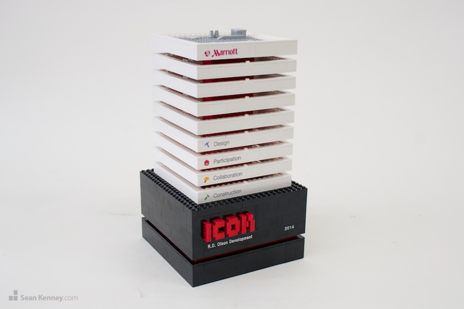
I was asked to “reimagine” or “upgrade” the award, which was originally designed in 2010 and lacked the sophistication and focus that such an important trophy required.
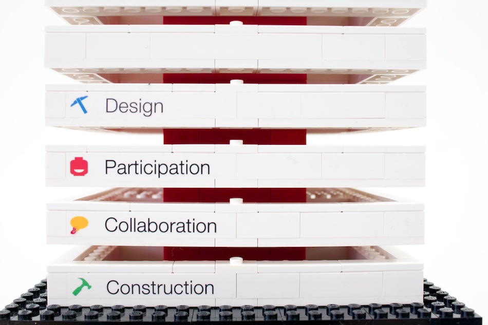
I eschewed the previous design’s “fun colors” and the “fun shape” (which made the award looked childish) and focused on red (from the Marriott logo) with neutral tones and a tight alignment with clean lines and simple shapes. The four graphical icons that represent the award were reduced in size to prevent them from overpowering the visual.
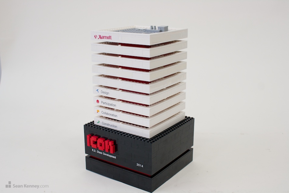
Overall I’m happy with the reimagined design and hope the award winners are too.